Thursday 4 August 2016

World Design Exercise: Game #10 (DOOM 2016)

Ever since its golden pioneering days as a quintessential first-person shooter, Doom was all about being over the top and absurd in its ultra-violence and fast-paced action.
Far removed from the more atmospheric previous entry of the long-standing Doom franchise, the latest addition pays loving homage to the original run-and-gun playstyle of the series, focusing more on the gratuitous gunning, hacking and punching of seemingly endless hordes of demons.

We can in a way compare the overall pacing of the latest Doom title and Doom 3, as previously mentioned prior, Doom 3 relied heavily on the foundation of atmospheric horror and the unfolding of an emergent narrative surrounding the UAC, thus we can perceive its pacing akin to the three act structure found mostly in other popular media such as films. In comparison to the later Doom title, Id Software’s Marty Stratton mentioned that while the game does try to keep the audience engaged with the overarching plot of the game, “story isn’t first and foremost” this time around as demon killing and “an amazing time” (Henaghan, 2016) takes precedence. Therefore, one would assume that due to the game’s more old-fashioned run-and-gun format, its pacing would have far more up and down episodes than say a consistent onward flow upwards while it is quite the contrary.


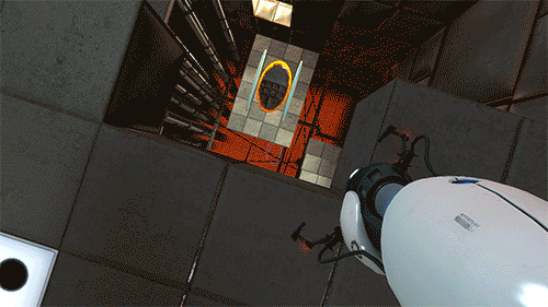
Fig 1. All of the classics are back and re-imagined, closer to its original more fast-paced predecessor in the new Doom title.

That is to say, even though these two games possess different approaches (even with the shared umbrella terminology as violent first-person shooters of the classic Doom franchise), which would result in almost entirely different experiences for their players, it is unfair to say that just because Doom ‘16’s is far more erratic and fast-paced means that it is mutually exclusive from following the standard three act structure.

Even with these differences, in the grand scheme of things and amongst the chaotic feel of the game, Doom ’16 does follow what Extra Credits’ James Portnow explains as the layered composition of what makes the overall pacing of a game (namely the arc, scene and the action) (Shepard, 2014) in a fairly concise and structured manner. If we are to say break down the very first chapter of Doom, the arc represents the overall plot that will play out as the player progresses, a scene is the opening chapter (or level) itself and the action interprets the individual actions of the player as smaller, but almost identical, processes of the much bigger arc (such as the rising anticipation of the player picking up their pistol and firing it for the first time in the tutorial level).


Fig 2 & 3. Despite the more chaotic run-and-gun nature of Doom '16, there is a clear structure to the way the game flows.


In a sense, while Doom is chaotic in nature, it is organized chaos as the engagement of the player are dictated by numerous factors of game designs such as the implementation of well-designed levels, countless hordes of demon to gun through (punctuated by moments of rest and terse build-ups), it is these moments of see-sawing between rest, rip and tear that keeps the player engaged and coming back for more.


REFERENCES:

Henaghan, L. Doom 2016. Retrieved from http://www.stuff.co.nz/content/dam/images/1/b/h/w/i/v/image.related.StuffLandscapeSixteenByNine.620x349.1bhf4n.png/1462760596353.jpg

Henaghan, L. (2016, May 9). Doom developer Marty Stratton talks guns, gore and gorgeous graphics. Retrieved from http://www.stuff.co.nz/technology/games/79754711/Doom-developer-Marty-Stratton-talks-guns-gore-and-gorgeous-graphics

Shepard, M. (2014, April 29). Interactive Storytelling - Narrative Techniques and Methods in Video Games. Retrieved http://scalar.usc.edu/works/interactive-storytelling-narrative-techniques-and-methods-in-video-games/pacing

Graphs created by the author of this post

Monday 25 July 2016

World Design Exercise: Game #9 (Star Control 2: The Ur-Quan Masters)

The Ur-Quan Masters is a remaster and port of Toys for Bob’s Star Control 2 (Accolade, 1992), which was developed for Windows DOS. While many cited Star Control 2’s complex combat system as one of the highlights of the title (improving upon Starflight’s already impressive combat mechanics), many have also agreed that it is the rich narrative world of Star Control 2 that really pushed the title as one of the most critically acclaimed PC games ever released, owing much to the amount of detail and work that went into crafting the numerous races and worlds in Star Control 2.

In the context of worldbuilding and creating sprawling fictional worlds such as those found in Star Control 2, one can assume that the developers have taken what Dungeons & Dragons have defined as a “top down” approach. As opposed to its “inside out” counterpart (which has the designer initially focusing on a particular smaller aspect of the game world needed for the narrative), the top down method is approached by the designer creating a broad generalized overview of the entire game world first. By creating foundations for all of the many planets, cities and races simultaneously, the entirety of the game world and its consequent narrative can come together in a harmonious manner. In a sense, it is like as if the designer was piecing the world together like a jigsaw puzzle.


Fig 1. Just a partial view of the huge star map of the available worlds the player can interact with.

One could argue that because the player begins their adventure in Star Control 2 within our known Sol System, it is considered the inside out approach as the kick-off of the story (with the Ur-Quan’s subjugation of the human race) is introduced by the player then by Commander Hayes at the Earth starbase. That and many of the alien races that the player will meet are designed with preconceived Earthling life forms that players could recognize, despite being supposedly completely ‘alien’ beings (such as humanoid Syreens, the feral Shofixti and even the Pterodactyl-like Yehat).

However due to the well-constructed nature of Star Control 2 and well integrated each race are in terms of their role towards the overall narrative of the story, it is fairly hard to imagine the designers taking a more tunnel-vision approach. It is in the same way that it is fairly difficult to imagine the sprawling world of Star Wars focused primarily on the desert planet of Tatooine, with a world as well thought out and as rich as Star Control 2, it certainly seems like the aforementioned top down approach being key to its conception into the game world.


REFERENCES:

Exonauts, J. Star Control 2: The Ur-Quan Masters Star Map. Retrieved from http://1.bp.blogspot.com/-69Dgfw11CdM/UoXLnMFuiaI/AAAAAAAAC7Q/BNRlc7ju5Nc/w1200-h630-p-nu/Star+Control+2+Ur+Quan+Masters+star+map.png

Tuesday 14 June 2016

World Design Exercise: Game #8 (SUPERHOT)

It is probably best to preface this blog post by stating that I have no idea what the fourth dimension is, other than the fact that it is only a theoretical made-up axis of spatial navigation. I will re-iterate by saying that while we have a fairly substantial understanding up until the third-dimension, we primarily depict and perceive the world in through the second and third dimension. Within the context of video games, it does for the most part boil down to two-dimensional imagery mimicking third-dimensional space, therefore when the fourth-dimension is brought into the equation it is quite understandably never a proper depiction of the fourth-dimension, but again a mimicry of what the fourth-dimension could possibly be.

Games like Piotr Kosmala’s SUPERHOT is one of a handful of games that had toyed with the concept of fourth-dimensional navigation, at least on paper. Because if we are to analyse the game and consider its premise (that time only flows when the player character is in motion), it can be considered that it is squashing and stretching the flow of time, moving along the constraint of time, rather than bending and distorting it. Consider this, from the point of view of the enemy characters, the player character will not be perceived as ‘blipping’ around the map and teleporting as most depictions of time travel is shown in popular media.


Rather, as far as the enemy characters are concerned, the player character will travel within the same wavelength so to speak of both their perception of spatial dimension and time, they would appear to have incredibly sharp reflexes, but again, happening in ‘real-time’ no different from any other characters in the game.
Conversely, there are other examples of shooter games that had experimented with the idea of time travel as a means of manipulating the fourth dimension, with characters like Quantum Break’s Shawn Ashmore and Tracer from Overwatch, both characters with the ability to travel and manipulate the flow of time, therefore it is unlike the aforementioned method mentioned in SUPERHOT.

As the second law of thermal dynamics state, time in theory only travel in one direction, due to a universal phenomenon many physicists call entropy. In the context of video games, in principle most of these video games are considered low entropy, as there are many outcomes of the player character manipulating the numerous constituent events within the game. While SUPERHOT still adheres to the constant forward-moving flow of time, Shawn and Tracer are able to break the very basis and law of time, that time can travel backwards.

It is imperative to emphasise that while the manipulation and depiction of the fourth-dimension in video games are interesting concepts that allow avenues of discussion in regards to our understanding of it, the truth is that as of now our understanding come from the act of mimicking it through our current understanding of both the second and third dimension.


REFERENCES:

Author Unknown. SUPERHOT BETA. Retrieved from http://static1.gamespot.com/uploads/screen_kubrick/368/3687506/2921719-superhot_beta_gs.jpg

Thursday 2 June 2016

World Design Exercise: Game #7 (The Stanley Parable)

When The Stanley Parable Demonstration was released many had cited the game’s critique on the video game industry through its blatant shattering of the fourth wall, as the player navigates through the levels they are accompanied by the disembodied sarcastic voice of Kevan Brighting, whose overall personality in some way depends almost entirely on the decisions made by the player as they experience the Demo.

First and foremost, the player will notice that The Stanley Parable is not a simple narrative driven adventure since right from the get go the Demo as it will demonstrate how the game is designed to completely subvert the player’s expectations time and time again; in the beginning the player discovers that instead of diving straight into the Demo, they are placed in a waiting room to partake in a behind-the-scenes sort of tester session for the Stanley Parable instead, establishing to the player that The Stanley Parable will be an unconventional and unorthodox gaming experience.


Fig 1. Central hub area of the Stanley Parable Demo.


After being called a sexual predator by the Narrator (in what appears to be a room comprised of buttons representing choice), the player will entire a facility warehouse where they can enter other sections of the Demo such as the Emotion Booths, a Wall Technology testing chamber and such, since here is where the player will learn about the inner workings of the ‘upcoming’ Stanley Parable game (and to an extent, practically other video games as well), how emotions are formed and implemented and how walls are representative of the types of game world confinement that players usually encounter respectively.


Fig 2. The infamous 8 Room, wherein the player can literally push the Narrator's buttons and essentially piss him off.


One of the more memorable portion of the Demo is the 8 Room, where the player is presented a button that quite honestly does nothing than display the number 8 whenever the 8 button is pressed. Here the narrator lambastes the player quite harshly should the player stick around and continue ‘playing’ the 8 Game, forcefully coercing the player to leave before they form any unwarranted impressions towards the full Stanley Parable game. On top of that there is a particular moment in the game where after the player leaves the testing facility, they trigger a narrative contradiction that breaks the demo, here the narrator gets really angry and scolds the player for deviating from the path and thinking on their own, both of these events are examples of the many instances where the game directly interacts with the player and of course the player’s actions interact with the way the game unfolds in a back-and-forth sort of manner.

The Stanley Parable Demo constantly shatters the player’s expectations by subverting the linearity of most narrative-driven games and is one of the strongest examples of interactive criticisms in video games.


REFERENCES:

Author Unknown. The Central Hub of the Stanley Parable Demo. Retrieved from http://images.akamai.steamusercontent.com/ugc/433780009363660034/71CB4488BDEC63912673FE15C423BCB89AEE1791/

Author Unknown. The Number 8 Room. Retrieved from https://i.ytimg.com/vi/9VtGaMrkhYM/maxresdefault.jpg

Tuesday 17 May 2016

World Design Exercise: Game #6 (Portal)

What started off as an independent title released by a team of DigiPen students, resulted in a spiritual successor that is considered as one of the most critically acclaimed titles released in the past decade or so.

The beginning of Valve’s Portal kicks things off by presenting the player with the simple concept of movement (even though arguably you would say at this point the WASD keys are almost instinctual to the player), in which case it is a classic example of Instructive Level Design. The player are encouraged to tackle the challenges ahead of them rather than being instructed explicitly on controls and certain concepts and mechanics like a tutorial level would. Portal has been praised for its concise level design, wherein the developers made conscious decisions to design Portal’s levels (in the form of separate test chambers) in a way that it is challenging, rewarding and fun without compromising the overall complexity of its puzzles.

When Portal does introduce a new concept to the player, on top of allowing the player to discover it by simply jumping in and experimenting, there are symbols that are used repeatedly to signal the player of certain mechanics present in the present chamber. For example, personally I have failed to consider the fact that you can die when being hit by a flying flaming projectile despite knowing that an icon presenting a person being slammed in the face by a spherical object travelling at high speed does have negative connotations.


Fig 1. At the beginning of each test chamber there are icons to hint the player as to the types of challenges that will be implemented.


These icons are still complementary to the more streamlined design of Portal’s puzzles however, because what Portal excels in in terms of level design is the implementation of what game designers call an antepiece. Because when the player appears to be doing a seemingly a fairly mundane task, such as simply picking a weighted cube up to place upon a pressure plate (button more like) to open a door, these mundane tasks are more often than will reappear in later chambers as part of larger and more complex tasks.

In conjunction to the application of antepiece however, one of the key concepts presented by Portal is repetition, not in the sense of presenting the same puzzle element in a boring ‘same thing over and over’ sort of manner, but as a method that Valve developers have dubbed as “mechanical reminders”. Where antepiece serves as a means for the game to expose the player to new concepts which will then be useful at a later time, a mechanical reminder serves to simply remind.

To sum up, a great example shown in the demo of Portal is test chamber number 10. Here the player who should already be familiar with the concept of how the portals work, is introduced to the idea of ‘flinging’. This concept in itself is in itself quite clever due to the fact that there is that added layer of simple common sense and a basic understanding of physics (in an arguably physics defying game yes) to solve this multi-layered puzzle chamber.


Fig 2. Here is the first portion of Test Chamber 10, which introduces the player to the basic concept of 'flinging' by utilizing a stationary orange exit portal.


The chamber is divided in a couple of sections, the first being a simple action of creating a portal entry portal (as the player is only able to manipulate blue at this stage) so that they are introduced to the concept of flinging themselves further than they could previously to reach the next portion of the chamber. By then the player will most probably figure out that the speed in which they reach upon entering the portal affects the trajectory and speed upon leaving the orange portal. Therein now lies the question upon approaching the next portion of the chamber, if I were to just pop a blue portal all the way down there, and drop from this distance, will it be fast enough to propel me over to the other side of the room?


Fig 3 & 4. The next couple of portions in the test chamber teaches the player that falling from a higher position results in the player vaulting out of the exit portals at a faster velocity. 

The way Portal encourages the player to think outside of laws constricted strictly within the presented game world is certainly one of the main reasons why Portal had captured the attention and hearts of its players. Its execution and design, while simple and easy to learn, presents the sort of complexity that does present its fair bit of challenges, but the reward is definitely sweet.
Except for the cake.

Never trust the cake.

Wednesday 27 April 2016

World Design Exercise: Game #5 (Fallout 4)

Interplay Entertainment’s Fallout (Interplay Entertainment, 1997) helped pioneer and pave way for the popular Fallout franchise, notably popular for its depiction of an anachronistic setting that is historically divergent of our own, reminiscent of the Atomic Age and the Googie architectural movement, frozen in the 1950's thanks to the Great War that both started and ended in 2077.

Fallout 4 (Bethesda Game Studios, 2015) is set a couple of centuries after the Great War in the Commonwealth of Massachussets, in that sense and true to tradition set by previous Fallout titles, there is certainly a sense of grounded realism due to the depiction of twisted versions real-life settings such as the aforementioned state (mainly in the capital of Boston), as well as the Mojave Desert and the state of Washington, D.C (renamed and reshaped as the Mojave Wasteland and the Capital Wasteland, respectively). Fallout 4, like its predecessors, certainly uphold the harsh dichotomy between the cheery and endearing optimism of the 50’s and the violent reality of Cold War induced nuclear paranoia.

The introductory portion of Fallout 4 is memorable in the sense that it embodies these two juxtaposed aspects of the 50’s, as the player begins by meandering about in their overtly art-deco inspired household within an assuming blue-collared neighbourhood. The player is then able to engage in playful banter with the beloved spouse in the character creation, spend some time with their newborn son, read the morning paper and other sorts of displays of a Sunday morning domesticity. 


Fig 1. The player's house in the beginning of the game, note the furnishings and its colours which are all heavily inspired by architectural movements such as art deco and the Space Age.

Fig 2. Straight off the bat, the player's nanny bot, Codsworth, is a walking talking example of Fallout's amalgamation between the retro and the futuristic technology of science fiction.

That is until a Vault-Tec representative comes knocking on your front door and the player and their family are then forced to run for their lives as the first nuke of the Great War (the entire catalyst of the Fallout series) drops just a stone’s throw away.

One of the big questions asked in regards to the aesthetic and setting of Fallout is “Why the 50’s?” as The Inquisitr’s Tony Smejek once pointed out that despite the understandable contrast between the whimsical optimism and nuclear horror of the 50’s found within the opening sequence of Fallout 4, “There is no real justification for the game’s cultural environment of the mid-20th century era to even be frozen in this time slot.”

One could argue however that the mid-20th century is the prime period, considering the resurgence of science fiction and the aesthetics of its futuristic technology reflected in architectural movements such as Googie, Populuxe and the Space Age in a melting pot of retrofuturistic design. More importantly however is the conflict between the United States and the Soviet Union during the Cold War, a period in time where nuclear threats were imminent and a primary source of tangible tension and unease for both nations at the time.


Fig 3 & 4. Comparison between a Fallout Shelter Handbook by Chuck West and a marketing poster for Vault-Tec's many Vaults in the Fallout series.

In Fallout 4 the player can modify and repair their Power Armour in their Googie inspired Red Rocket Truck Stop garage while Nat King Cole’s Orange Coloured Sky blares from a nearby radio in all of its lo-fi glory, or go toe-to-toe with mutant bears armed with a Space Age alien blaster pistol in a post-apocalyptic world where a nuclear holocaust signalled both the beginning and the end of a bygone era. 

It is this conscious aesthetic decision, the combination of the retro and futuristic science fiction, creating a visual bridge that had helped captivated generations of players, allowing them to immerse and feel a wave of 1950’s induced nostalgia despite realistically not growing up in such an era.


REFERENCES:

New Super Best Friends Play Fallout 4. (2015). Player's Living Room. Retrieved from https://www.youtube.com/watch?v=xhhHcQliT4E.

New Super Best Friends Play Fallout 4. (2015). Codsworth. Retrieved from https://www.youtube.com/watch?v=xhhHcQliT4E.

Source Unknown. (Date Unknown). Fallout Shelter Handbook by Chuck West. Retrieved from http://s3-eu-west-1.amazonaws.com/infogram-particles-700/davida1366311193.jpg.

Interplay Entertainment. (1997). Vault-Tec advert and in-game town map of Vault 13. Retrieved from http://vignette3.wikia.nocookie.net/fallout/images/0/05/Votf.jpg/revision/latest?cb=20110116001328.

Wednesday 13 April 2016

World Design Exercise: Game #4 (Prince of Persia: The Sands of Time)

As a reboot and re-imagining of Jordan Mechner's original Prince of Persia series, The Sands of Time had received critical claim due to its numerous platforming innovations, pioneering many mechanics for later platforming titles to date and even producing a film of the same name despite initial fairly lacklustre sales.

Right from the beginning the game had always contextualized the architectural style of ancient Persia even with the original Prince of Persia title (Brøderbund, 1989), as its cinematics depict the more opulent aspect of Iranian architecture, as opposed to the more muted representations of Achaemenid architecture perpetuated by recent popular media in the West.

In the Sands of Time demo, very early on in the game we can see that there are clear inspirations from Achaemenid style (Persepolis) architecture, and while it does contrast from the aforementioned more opulent aesthetics that inspired the original Prince of Persia, players can still make out the Persian inspired architecture due to other universal imagery such as the game’s use of the Iranian date palms and Islamic domes on the buildings established at the very beginning of the game.

Fig 1 & 2. A comparison between the very opulent architecture found in the original Prince of Persia game and a Persian hallway.

Fig 3. The establishing shot of Prince of Persia: The Sands of Time.

Another thing to note however is that almost straight away players will also note inspiration from other middle-eastern cultures such as Indian (due to the murals and paintings found inside the Maharajah’s Treasure Vaults). For the nitpicky this is perhaps a warning flag considering that Indo-Persian influence happened much later in history (Sands of Time was said to take place during 9th century AD whereas cross-cultural Indo-Persian interaction did not come to a head until the peak of the Delhi Sultanate during the 13th century).

Shortly after the courtroom ambush sequence (which in itself is lavishly decorated with Persian rugs of sorts, a Persian aesthetic staple), the player will encounter a courtyard which is seemingly inspired by the Hanging Gardens of Babylon. At this point, you can argue that the hodge podge of different architectural styles is primarily strong evidence that Ubisoft had swayed towards gameplay over accurate cultural representation by creating a cultural Frankenstein monster of sorts.

 
Fig 4 & 5. The courtyard level that is most probably inspired by the Hanging Gardens of Babylon.


Nonetheless, it does go to show that designing these worlds within the game as such are all conscious aesthetic decisions as it allows both the gameplay and world design work from one another in a back and forth manner, where gameplay mechanics are contextualized by the theme and architecture of the game world. Even if The Sands of Time’s Persian-inspired world is more or less an amalgamation of numerous middle-eastern cultures (ranging from Turkish, Indian to Mesopotamian), the sort of iconography used within the game does allow the player to make cultural connections between the game and its intended thematic game world.


SCREENSHOT REFERENCES:

(all Sands of Time screenshots in this blog post were taken by the author of the post)

Author Unknown. (Date Unknown). In Game. Retrieved from http://gamesdbase.com/Media/SYSTEM/Atari_ST/Snap/big/Prince_of_Persia_-_1990_-_Br%C3%B8derbund_Software.jpg

anavia. (2012). Persian Architecture. Retrieved from http://pre11.deviantart.net/87a5/th/pre/i/2012/036/6/3/persian_architecture_by_anavian-d4osn2d.jpg


Thursday 7 April 2016

World Design Exercise: Game #3 (Kairo)

Richard Perrin’s Kairo is a strong example of emotive environmental narrative, wherein the story of the game unfolds as the player explores a world devoid of representative imagery and dialogue, but primarily represented through brutalist inspired architecture. 

Right from the beginning the player appears to awaken from and within a white void, before a floating throne room of sorts. It becomes clear that the player is forced to move onward towards the only visible structure in the distance, and as they near the structure, audio cue chimes in, signalling to the player that they are on the right track and prompting them to proceed.

Fig. 1. The starting zone, straight away the player will notice a vague structure in the far distant that they can approach and explore.

When inside, the player will encounter a glowing rune (resembling a tree) engraved into a stone wall, and yet another throne with the same rune etched into it. Grooves in the ground will provide clue for the player to interact with the throne, pushing the two runes together. The fact that these runes are the only illustrated visual iconography the player will encounter in Kairo emphasizes the central role these symbols or runes have in aiding the player in solving the game's puzzles.

Fig. 2. Grooves on the floor is an intuitive visual cue for the player in this particular puzzle.

As the player walks, arches (reminiscent of Japanese Shinto gates, known as toriis) will appear, perhaps insinuating that as the player moves onward, they are transitioning into an area that is considered sacred, or even profane. These sort of imagery, while not blatant and explicit, helps add flavour to the game and allows for the player to connect and ground themselves within an already very alien space.

Which consequently, after a simple bridge puzzle, the player will encounter an area which seems to be a crude representation of what appears to be a park. Is this perhaps a breather for the player in the form of an abstracted oasis? This is probably befitting considering that the next area is a hub of some sort, with a central fixture surrounded by portals.


Fig. 3 & 4. The 'park' level as well as the centralized hub area that soon follows.

Every single portal leads to individually themed areas with corresponding puzzles, and what is interesting to note that despite the consistently brutalist (almost minimalist) architectural aesthetic, all of these separate rooms are still distinctively unique and different from one another, not only because of the fact that the rooms are clearly colour coded for the player’s convenience, but that structures come in forms and shapes that players can universally associate. Such as a generator, structures resembling a network of treehouses, and even a hallway resembling a mausoleum.


Fig. 5, 6, 7 & 8. The many different 'themed' rooms that the player will encounter, notice that despite the simplistic aesthetic of the architecture, they are all represented in ways where the player can recognize universal form and imagery.

Throughout the demo as well, the aforementioned rune appears in places, landmarks and crucial components of room puzzles as visual guide to assist the player in progressing. Completion of these puzzles will take the player back to the hub area, completing a full circle back to where the player started while simultaneously ultimately ending the demo.

Kairo's aesthetic choice is clearly communicated as a means for the player to focus on the gameplay and puzzles rather than having literal depictions of objects and contextualization to detract the player from the isolated and puzzle-heavy element of the game.


REFERENCES:

(all screenshots were provided by the author of the post)

Thursday 17 March 2016

World Design Exercise: Game #2 (BioShock)

A spiritual successor to the System Shock series, Irrational Games’ BioShock (2K Games, 2007) was critically acclaimed for its storyline, immersive biopunk environments as well as its unique representation of its fictional Orwellian underwater city, Rapture. To help immerse the players, clever and efficient world design is key to allow such players to experience the world of BioShock, by playing the demo, we will be able to analyse just how even the first half an hour or so of the game can convey so much.

The game begins straight after the player experiences a cutscene depicting a plane crash into the Atlantic Ocean, causing them to resurface to find themselves surrounded by fire, which serves as a contextual visual guide, urging the player onward to find a hard-to-miss landmark, complete with flickering lights at the bottom of the stairs as a visual cue for the player to boot.

Fig 1. The aforementioned unmissable landmark, not conveyed in this screenshot, but a light is broken at the bottom right, drawing the player's eyes to the flight of stairs there.

As soon as the player enters the building and into complete darkness, only for the room to light up, revealing a statue of Andrew Ryan, a banner proclaiming “No Gods or Kings. Only Man.”, providing an emergent narrative and clues to the player on the secular and objectivist nature of Rapture. As the player continue onwards, they are guided primarily by music towards the bathysphere (with the music growing increasingly louder the closer the player is). Entering the bathysphere will trigger a cutscene that will introduce the player to the splendour of Rapture with panning establishing shots.

Fig 2. An introduction to Rapture and its creator's ideology.

The player will then witness the demise of Johnny at the hands of a splicer, before leaving the bathysphere in order to progress. Despite the darkness of the level, again there are visual cues that will aid the player, such as a single flickering static monitor, as well as a singular spotlight on a conveniently placed wrench. 

Fig 3. The singular lonely wrench, ready for the taking.

Since the player can now combat enemies, they will encounter some splicers later on, before coming across a plasmid vendor, causing the player to black out and wake up in front of a previously inaccessible door with a “fistful of lightning” (a simple puzzle which comes in the form of a broken control panel with the same coloured bolts as the ones in the player’s hands). Once the player is able to move on, they will then come across a rather memorable part with a splicer talking to her ‘baby’, the player will of course naturally peek inside the stroller, discovering their first firearm, a revolver.

Fig 4. One of BioShock's more memorable scenes, providing one of many insights of how far Rapture has fallen.


Inside the Kashmir Restaurant a distant couple of voices can be heard, prompting the player to seek out the source and discovering two splicers arguing, which is also visually framed in such a way that the player can witness the exchange without being noticed, and strategize their approach accordingly. Taking care of the splicers will allow the player to move on into the Footlight Theatre, where Atlas will introduce the player to the backstory and explanation for the Little Sisters. A broken flight of stairs that the player will have to drop from can inform them that it is a point of no return, and that usually such cues are evident of the end of a chapter, or perhaps a significant encounter of sorts shortly after, which comes in the form of an indirect confrontation with Andrew Ryan himself. 

Fig 5. The player's first proper interaction with Andrew Ryan, Rapture's creator and founder.

During this timed and scripted event, splicers being to attempt to break into the room which the player is trapped inside, heightening the already tense situation, which ends only when Atlas finally opens the locked door for the player to flee through.


SCREENSHOT REFERENCES:

(all screenshots in this blog post were taken from Mike Mangold’s Visual Walkthrough website)

Mangold, M. (2008). More flames block your path, but you can see this building to the right of the plane's tail section. Retrieved from http://www.visualwalkthroughs.com/bioshock/welcome/5.jpg

Mangold, M. (2008). This statue and slogan are your first introduction to the philosophy of Andrew Ryan. Retrieved from http://www.visualwalkthroughs.com/bioshock/welcome/8.jpg

Mangold, M. (2008). Grab this wrench and use it to smash the debris blocking the door. Crouch to squeeze through, then avoid the flaming furniture as you ascend the stairs to the lounge. Retrieved from http://www.visualwalkthroughs.com/bioshock/welcome/19.jpg

Mangold, M. (2008). Turn right to witness this disturbing scene. Finish off the Thuggish Splicer and grab the revolver in the baby carriage. Retrieved from http://www.visualwalkthroughs.com/bioshock/welcome/35.jpg

Mangold, M. (2008). Watch this message from Andrew Ryan. More Splicers attempt to get to you, but are held back. Retrieved from http://www.visualwalkthroughs.com/bioshock/welcome/53.jpg

World Design Exercise: Game #1 (DOOM Map)

I was one of the many students who struggled initially with getting the hang of the Doom Builder, which was a primary factor in my designing the level to be incredibly simplistic and fairly easy to finish. I have attempted to achieve this by creating the numerous sectors of the maps in loops as well as ‘horse-shoe’ shapes.

Fig 1. A topography of the entire custom Doom Map.

The player starts off in a small ritualistic room a dead demon with only one exit, pushing the player to move forward in a linear fashion as well as introducing them to one of Doom’s basic enemy, the Imp; later on, the slightly larger circular room that follows helps introduce the player to handle multiple enemies at once.


Fig 2. In the starting room, the player is introduced to the concept of coloured keys and doors right from the beginning.

When the player continues onwards towards the central hub, they will encounter the much harder enemy, the Chaingunner, who drop his chaingun for the player to pick up (this will then be the player’s primary weapon for a good portion of the remaining level).

As previously mentioned, the next couple of sections the player will encounter will take the form of loops, that way the player will return to the central hub multiple times to take a breather before moving on to collect the next coloured key. The two curved yellow arrows shown the map above for example emphasizes the 'U' shape for two sections of the map to show how the player is able to return to the hub section of the level without needing to backtrack where they came from and to prevent repetition.

Once all of the coloured keys are collected, the player will then make move on forward towards the final ‘boss’ room, with an optional room for them to explore and collect a huge armour bonus for the final room (again, it is optional, the armour will only make the final room a much easier encounter, therefore the player is more than welcome to move on instead). In typical Doom fashion the boss level is structured as an ambush with areas where the player can hide and restock on ammo and med packs.


Fig 3. The numerous coloured doors that players are directed to unlock in order to unlock sectors and move on.

Overall the doom level itself is incredibly simple, but I have hoped that many of the fundamental level design aspects I have learned were shown in some ways, such as utilizing a looping (or ‘horse-show’) so the player will return to the hub multiple times, strategically placing items and enemies and ramping difficulty accordingly. Another aspect of the level that I wish I had executed better would be set-dressing, because while I have tried to theme sections of the map accordingly, I feel like my limited knowledge of Doom and the level builder in general hindered my process.


REFERENCES:

(all screenshots were provided by the author of the post)